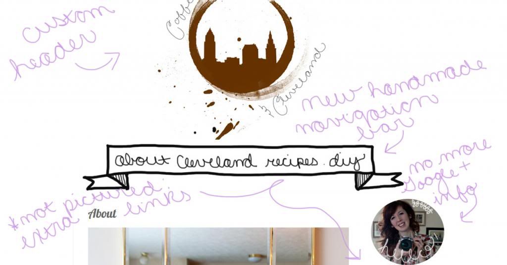
I spent several hours working on my new blog layout. I love simple, but I wanted it to be a little more "me" than the typical layouts Blogger has to offer. All the writing is my ow handwriting. I don't know how I feel about that yet, but I haven't found a font that was quite what I wanted for my blog. So, for now, it'll stay just like this.
I was lucky enough to have Tim create the Cleveland skyline coffee mark logo, which you can read about here.


yay! I like the new layout and picture!!!
ReplyDelete